Nextech Design System
Design System
- Industry – Healthcare
- Component Library
- Patterns and Branding Guidelines

Overview
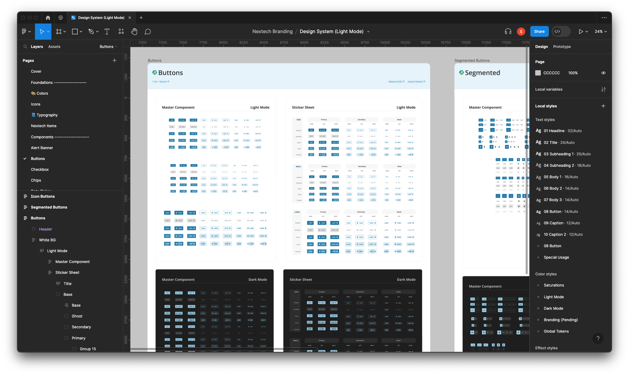
To achieve this, I focused on developing a comprehensive UI kit and accompanying documentation for all components and UX patterns. The UI design approach was based on the Angular Material framework. It offers a suite of pre-designed, customizable, and accessible components, which allows developers to use without starting from scratch.
Tools
Figma, Zeroheight
Framework
Angular Material
Governance Process
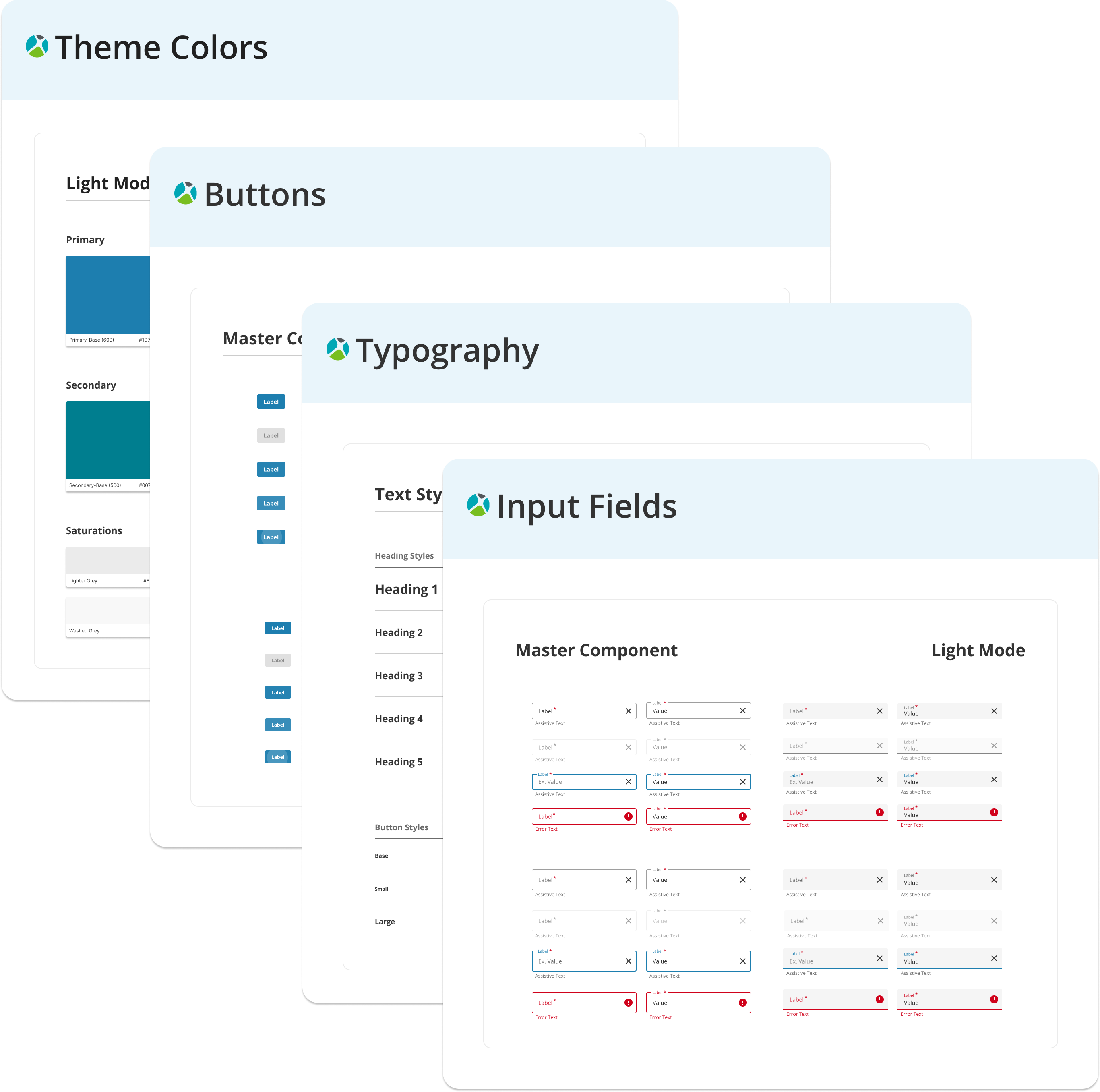
I advocated and adopted the Brad Frost’s Atomic Design structure when I took on the project and created all the components in the library.
Library
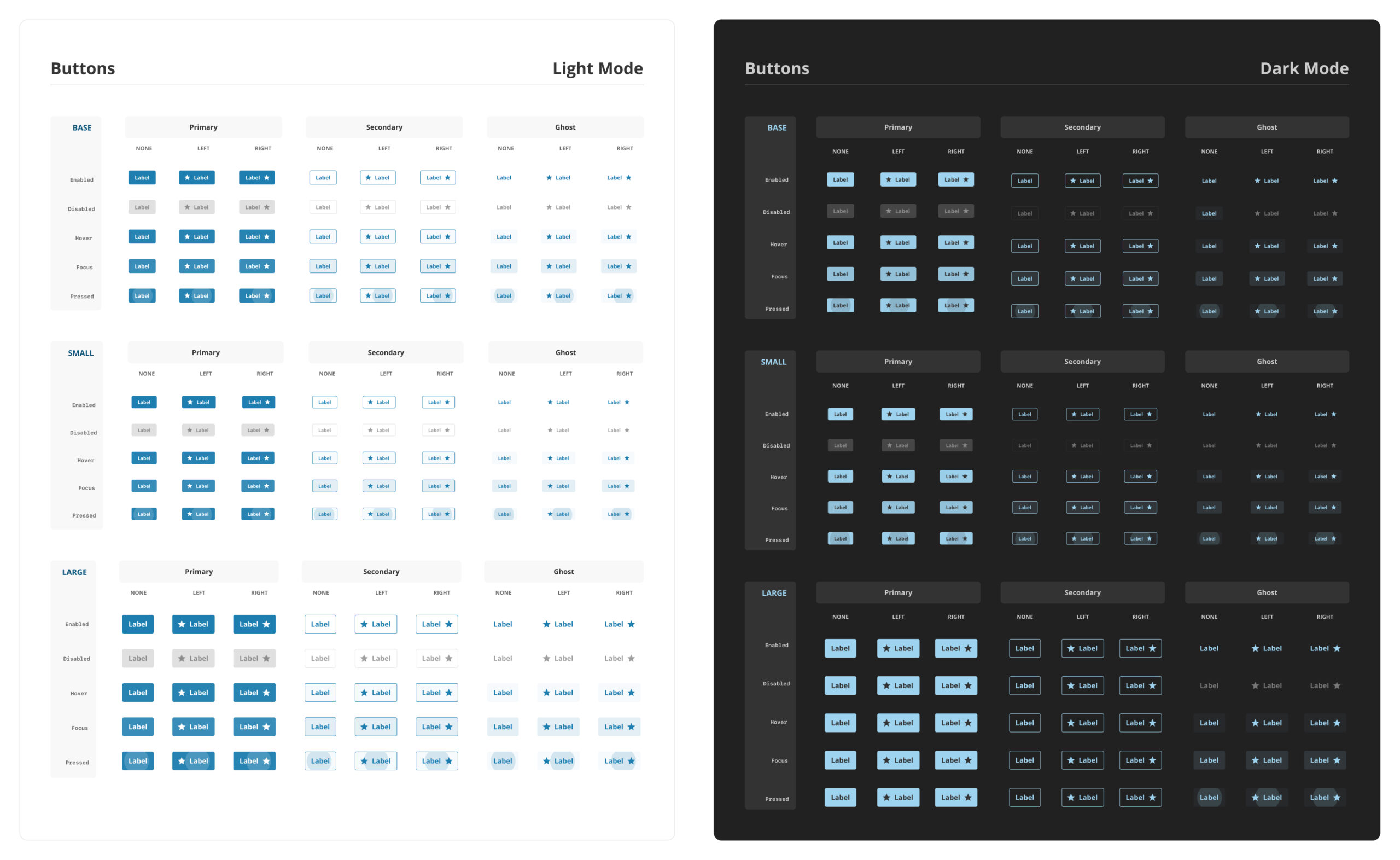
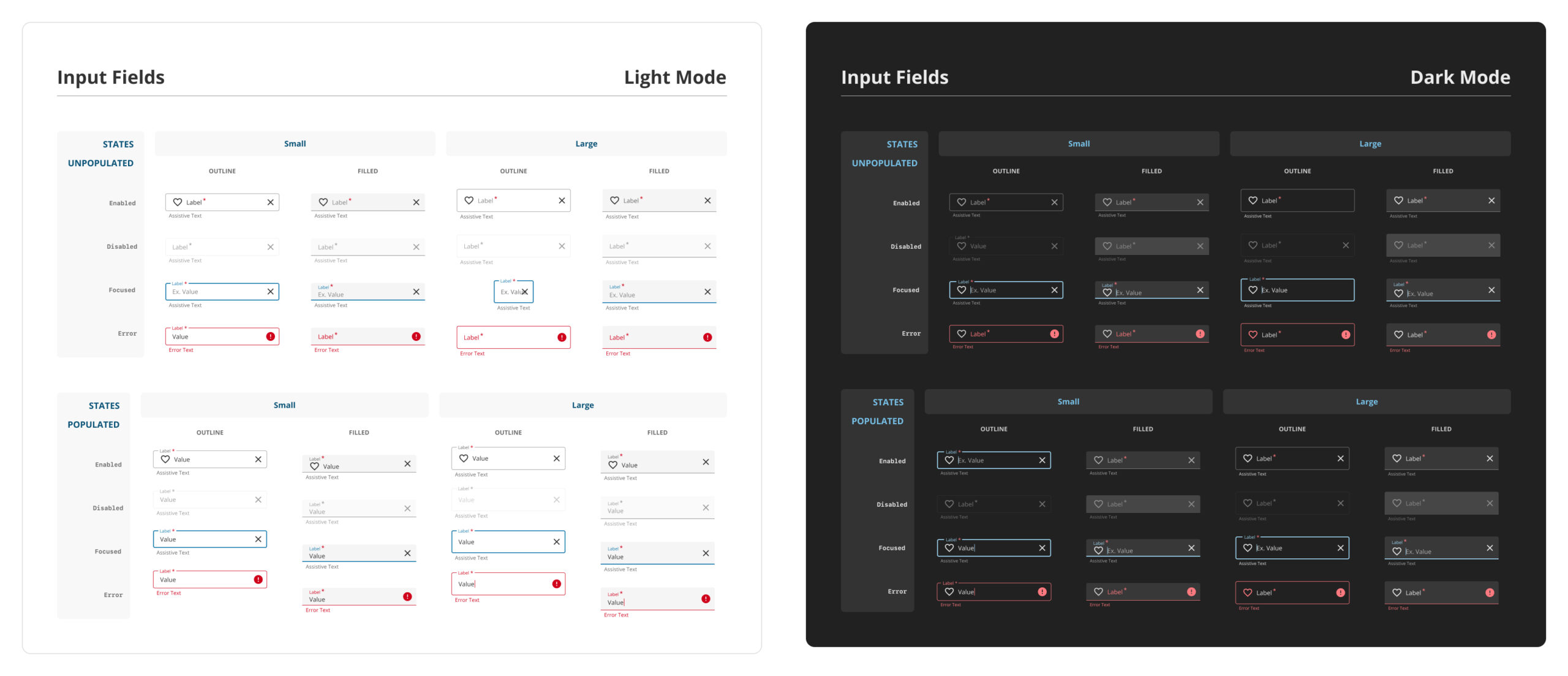
- Components
- Typography
- Colors
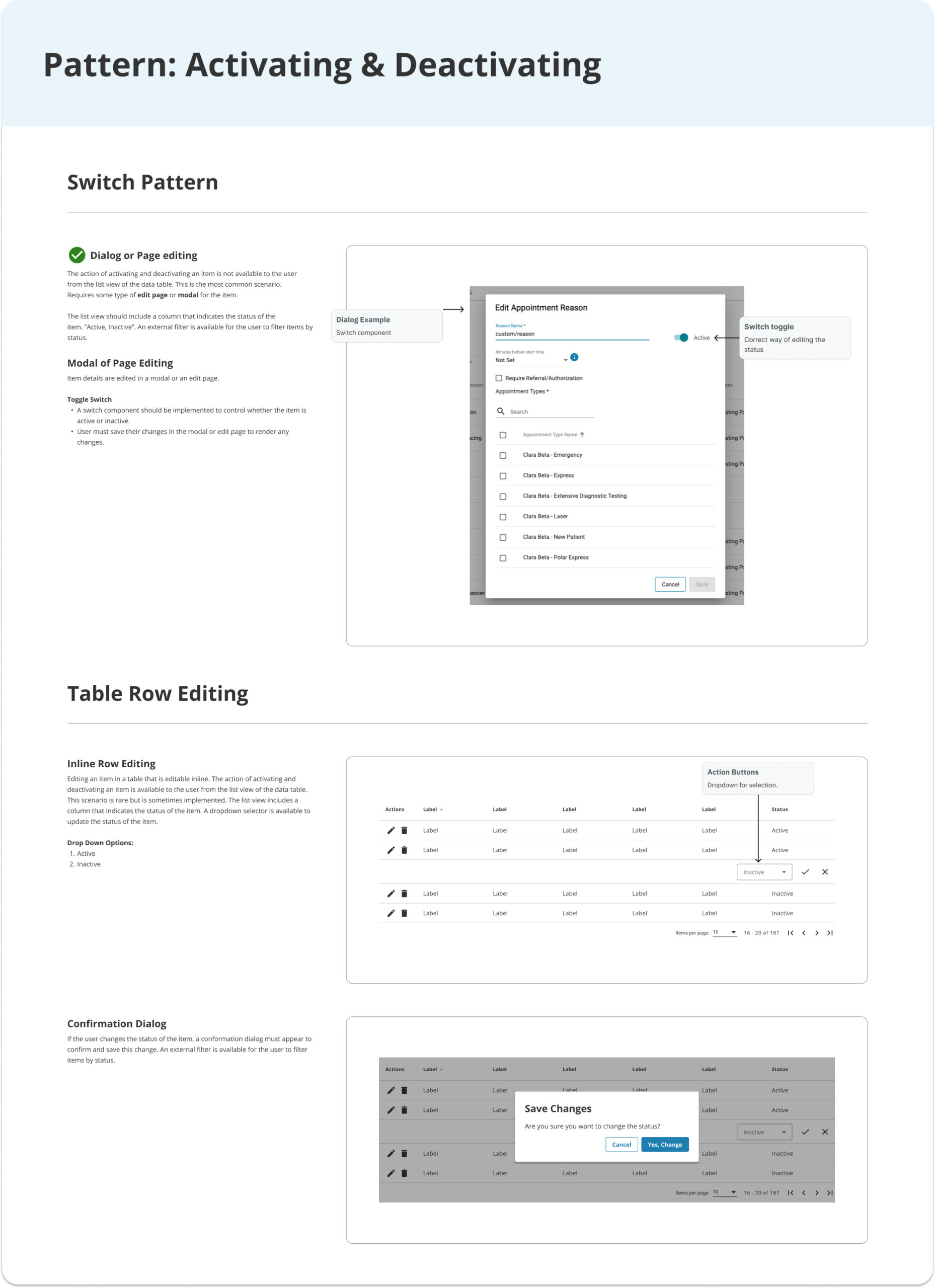
- Patterns
- Guides
- Templates
- Branding
- Documentation
Typography
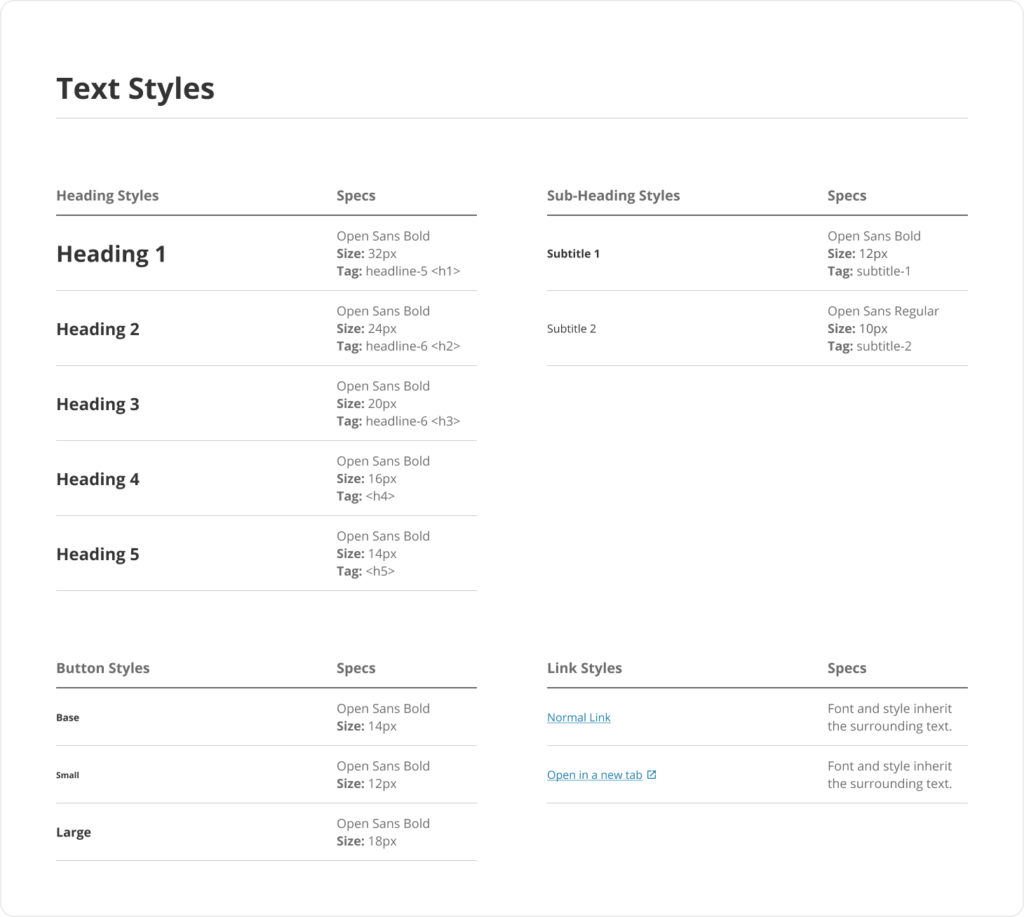
This consistent and structured presentation enhanced the user experience, providing a sense of uniformity and cohesiveness throughout the application. The balance between the low contrast scale and other design elements, such as font weight, line height, and color, was crucial in maintaining differentiation and readability within the application’s interface.
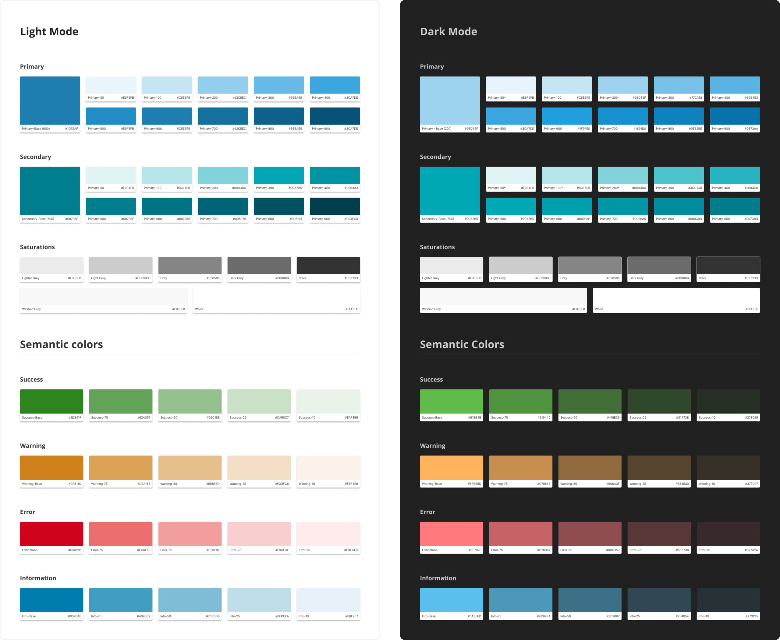
Color Schemes - Light & Dark Modes
consistency and accessibility across the applications, we conducted a comprehensive audit and proposed a new color system. Our approach involved defining a primary color and an accent color that complemented the existing blue shade. Additionally, we introduced semantic involved defining a primary color and an accent color that complemented the existing blue shades Additionally we introduced semantic colors that adhered to accessibility standards for both light and dark modes. By incorporating these carefully selected colors, we aimed to improve the overall visual appeal and usability of the applications, while ensuring compliance with accessibility guidelines.
Components
